Showing posts with label Penny Black. Show all posts

Friday, August 17, 2018

Butterfly Doily


This designer paper is different in that it seems to change color depending on what colors it's around. When I saw it in the pad, it looked like a grayish hue. My husband saw it and thought it had some green in it. But I liked the look of it paired with this chocolate brown paper, which makes the print sort of a mocha color. I thought the little doily resembled the flowers, so that's how the card came together. The butterfly just happened to be something small enough to fit on the doily. I wish you could see the shimmer on the butterfly's wings though -- that's my favorite part of the card.

Have a great weekend!

Supplies:
Stamps - sentiment by Hero Arts "Everyday Sayings"; Butterfly from Penny Black "Enamor" clear set
Paper - from Love Nicole "Delicate Floret" 6x6 pad
Ink - Versamark for sentiment; Ranger Adirondack "Espresso"
Dies - unbranded doily
Accessories - White embossing powder

Friday, August 10, 2018

White on White


I've always thought cards with multiple white layers look very elegant -- especially when there is texture included, such as embossing. I've long admired others' cards, and finally took a stab at it myself.

I started by embossing the top layer, only I used a Darice embossing diffuser, in this case, a plate which has an oval cut out of the center. Used with the regular embossing folder, it keeps the area in the oval from being embossed, so it stays flat. After embossing the design, I then used an oval die over the flat oval to cut out the flat part, and also leave a nice border to the cut edge.

I stamped the sentiment on the bottom layer (the folded cardstock) and then adhered the embossed piece over it. Easy to do, and I like the results. If I wanted to make it more elegant -- such as for an invitation, a nice white satin ribbon would be pretty -- but I'm keeping this one flat so it's easier to mail.

Enjoy your weekend!

Supplies:
Stamps - Penny Black "All Great Things" clear set
Paper - plain white cardstock
Ink - Versafine onyx black
Dies - Spellbinder "Ovals"
Accessories - Darice embossing diffuser, Sizzix embossing folder

Wednesday, July 25, 2018

Plaid with Flowers


This week's CAS challenge at Splitcoast asked us to use plaid in our creations. I actually had a piece of plaid out on my table with this teal textured cardstock that I thought could work together, and when I found this scalloped circle in a baggie of leftover elements, the card came together.

The flowers are from the "Enamor" clear set by Penny Black, and the sentiment is from "Kind Words" by Verve. I used copic markers to color the flowers. The plaid paper is from and American Crafts 6x6 pad called "#summer" -- which is filled with some of the brightest colors and designs I've ever seen in papers! Just using a small strip like this helps to tone it down a bit.

I have a special coupon code for Hambo Stamps that is good thru the rest of this month. Mention "CAS35" when you order to save 35% on all Hambo stamps thru next Tuesday (31st). This code is not referenced on the Hambo website anywhere, and is a special code just for my blog readers.

Have a great day!

Wednesday, July 18, 2018

Faith Hope Love ... and Persistence


One day I was playing around with Distress Oxide inks, and while not everything I made turned out the way I wanted, almost all produced something that could be salvaged. Such was the case with the colored panel above. The distressed piece as a whole was kind of crazy, but trimmed down, I liked this smaller panel. I embossed the Stampendous agapanthus flowers in white so they would stand out from the multicolored background. The sentiment is from the Penny Black clear set called "Faith."

I have to be honest: I had originally used this flower panel on another card that I'd made for my card ministry. I have a card rack in the lobby at church where people may browse the cards, and take any cards that they'd like, with the purpose of sending to a church member or friend who could use a lift in spirits.


Mostly I put general "hello/thinking of you" themed cards, with a few "get well" or "sympathy" cards thrown in, and the cards are usually chosen fairly quickly. Occasionally, though, there are "duds" -- cards that no one wants. The original one with this panel was one of those duds. I'd liked the card I made, but for some reason, no one else did. I got tired of seeing it left on the rack week after week, so I eventually brought it home. Not wanting to throw the whole thing out, I pulled this colored panel off the card and saved it, until I decided to use it on the card above. I put it back in the card rack the next week, and it was chosen immediately. This card wasn't that different than the original, but for whatever reason, this one must have spoken to someone, whereas the other one just sat there being aloof. LOL

I guess the lesson to be learned is to never throw anything away ... uh, be persistent! :)

Monday, July 16, 2018

God of Hope


Cards don't get much easier to make than this one -- even with the added step of framing the designer paper with a solid color of cardstock. This is more of that gorgeous paper from the Love Nicole "Aquarelle" pad. The stamp is from a set called "Gifts From Above" by Penny Black.

Short & sweet -- just like any Monday workday should be. Have a great week!

Friday, June 22, 2018

Rusty Rose


If you're like me, when you flip through a designer paper pad, there's usually one or two patterns that you kind of say "Aaack! What in the world will I do with THAT??" This was one of those patterns for me. While I really love almost all of the prints in Love Nicole's "Aquarelle" pad, this one was quickly skipped past. And, as has happened before, what I originally didn't like ends up being a favorite. Go figure.

The thing that originally stumped me was the color combo, I think. Powder blue, mixed with rust, mixed with purples? Oh, and some olive green for good measure. I was trying the print out with different solids, and when I hit upon this SU rust color, I liked it! Suddenly, it seemed like the color combo made sense. I added this flower from the Penny Black "Enamor" set, which I colored with Copics. This is probably the first time I've used my Copic markers in at least a couple of years, but I'm happy to say they were still mostly juicy.

I added the Hero Arts sentiment, stamped on a banner die from a Becky Higgins (American Crafts) die set found at Tuesday Morning. There are 8 really useful dies in the package, for $4.99. Score!

Since I still have time, I will enter this into Jeannie's "Rose Garden" challenge that ends this weekend. There's time for you to play along too!

Have a great weekend!

Monday, June 11, 2018

Metallics


I've decided that I really like metallic cards! The shine catches your eye and makes them look special. I might not have tried using solid metallic sheets had it not been for this background paper ("Delicate Floret" pad by Love Nicole) which I loved, but wasn't sure how to use alone. When paired with some solid metallic gold - WOW! (<---- that was my daughter's exact response.) I wish you could see in person how pretty this looks! My metallic paper is from a DCWV 6"x6" pad.

To go along with the papers, I embossed the Hampton Art sentiment ("Hope & Faith" set) using a champagne-colored embossing powder. It matches quite well and doesn't look gaudy, as sometimes TOO shiny gold does.

I used the trimmed scraps from the patterned paper to make a second card:


This time I used a really large Penny Black scripture (from "All Great Things" set), also embossed with the same champagne powders. I'm happy with how both cards turned out, and look forward to more opportunities to use metallics.

Monday, May 21, 2018

Stencil 2 Ways

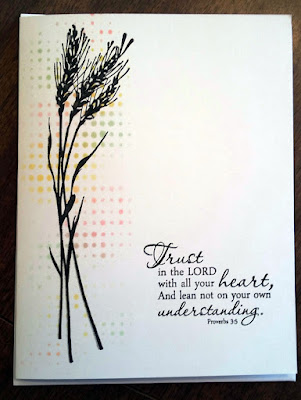
I have two cards for you today, both using the same "Dot Fade" stencil by Tim Holtz, but in a yin/yang kind of way. For the first card, I used different colors of Ranger oxide inks to color over the stencil, until I had a random pattern of colored dots. Over this, I stamped wheat stalks from Inkadinkado's "Meadow" set, and finally added the Proverbs 3:5 scripture stamp from "Scripture Medley 1" by Verve. This resulted in a very quick one layer card which will be perfect for my card ministry, in that it can be sent for any occasion.


As I began to clean up, I noticed that I still had quite of bit of oxide ink residue left on the stencil. Instead of wiping it off, I misted it up, turned the stencil over, and positioned it on a new white card base. Because the oxide ink reacts with water, I ended up with a beautiful water-colored design.


This time I used a Memory Box "Prim Poppy" die cut over the colors, and stamped a sentiment from Penny Black's "Faith" clear set. And just like that, two super simple, minutes-to-make cards!

Friday, May 18, 2018

Have a Great Day!


This card uses the same "dogwood" patterned paper that I featured on my first blog card. The paper is from a 6 x 6 Love Nicole pad called "Bouquet of Color." If you add this background, plus the strip used on the other card, you will see that I got 2 cards out of just one 6 x 6  sheet of paper. I finished this super simple card with a sentiment and butterfly stamp -- both from the Penny Black clear "Enamor" set.

I might be drawn to dogwood trees, because not only is it the state tree here in Virginia (and we have 2 beautiful ones right in front of our dining room window), but I also grew up with one outside of my bedroom window in Florida. That tree had also been pretty, until I tried climbing in it one day, and split the tree in half. It was never the same after that, and something that I always regretted! Funny thing about our trees now in VA: the 2 trees grow so close together, that they appear to be just one tree. The giveaway, though, is in the spring, when they bloom different colors -- one pink and one white. It still looks like a tree that's been grafted together, but if you look closely, you can see that they have 2 trunks.

Wishing you all a great day!

Wednesday, May 16, 2018

Monochrome


This card was originally going to be a Mother's Day card for my mom. Problem was, while she can appreciate a hand-made card, she likes the mushy verses found inside Hallmark cards. I'm not a mushy writer, and though I attempted some nice lettering and a verse inside, and I even put the card in an envelope with a stamp on it -- I ultimately pulled it back out of the mailbox. Instead, I decided the Hallmark card was less of a gamble, so I bought and sent her one of those. (I actually sent a Hallmark birthday card instead of a Mother's Day card, because I liked the verse better.) Still, this card was salvaged. I cut the front off and mounted it on a new white card base. The monochrome look is very pretty in person.

The flowers are from a Penny Black clear set called "Enamor." It's a handy set for general purpose cards because it has several different flower stamps, a butterfly and a saying. You'll see that I used more of the stamps from this set on my next card.

Thanks for looking!

Monday, May 14, 2018

Shine on!


Here are a couple of CAS cards that feature metallics. They look great when the light catches them and are simple to make. The lack of frills helps make these cards a nice choice for a man, as he can look at them without the fear of getting glitter or floral cooties on himself.


For both of these I used a die cut, with the metallic paper showing through from the back, then mounted on a white card base.

I tend to use white card bases the most for my card ministry cards. I either use the plain white card as I did here, or I adhere a designer paper to the front. For the times when I use colored card stock for my base, I add a white paper liner inside. Since many of these card recipients will be elderly church members, I want to make these cards as easy as possible to read.

I also use "thinking of you" quite a bit as a sentiment, because it covers most reasons why you'd send a card. Whether the recipient has been shut-in and unable to attend church, or has been sick, or has had a death in the family, or has had a birthday -- in any of these events recipients can appreciate that someone has them in mind. I pair this simple sentiment with bible verses, so when this is on the outside of the card, a bible verse is inside, or vice versa - no pun intended!

Friday, May 11, 2018

What's a Card Ministry?


I've seen a lot of posts on message boards saying "I've made these cards -- now what do I do with them?" If you are a person that only makes cards for specific occasions, then this would seem like a dumb question. But cards are often made with no special occasion, or even recipient, in mind. This could be the case for those on design teams who need to feature certain stamps or supplies as part of their requirements, or a person who loves to create, but maybe doesn't have family members who appreciate hand-made things. {Clutching my pearls!} Either case could result in a pile of cards with no intended destination.

My own card ministry serves my church, but a card ministry doesn't have to have religious implications.  The main idea is to make/provide/send cards to someone who will appreciate receiving them. It's that simple. Hospitals or rehabilitation centers are often receptive of cards for their patients -- both to receive, as well as to send out. Elderly care facilities might love donations. (The assisted-care facility where my in-laws live has a small "general store" where they sell these cards. Not only does it allow the residents to be able to find inexpensive cards to send, but the proceeds are added to a fund to buy games and things for the residents to enjoy.) Then you have the military option. While Operation Write Home is no longer collecting cards, you might find other agencies who will accept them for our troops. The main thing to keep in mind if you wish to donate cards is to keep your target audience in mind, and only send cards that would be appropriate for those recipients.  When in doubt, ask a representative of the organization or facility for guidelines as to what would work best.

My card-making tip for today is: when you have beautiful paper, don't fight it and don't cover it up! Such is the case for this water-colored design. It is so pretty that I hate to even use it! I would love to just put it in a frame on the wall so that I could admire it every day; luckily, this comes from a pack ("Aquarelle" by Love Nicole) that has more than one sheet of each design, so I have some to share. ;) I used the white space of the design for my scripture, which is from the Penny Black set "All Great Things." This set has scriptures in large sizes that are also great for making bookmarks. Though super simple to make, I'm quite satisfied with the end result of this one-layer card, and know it will be a hit (= immediately selected) in the card rack at church!