Showing posts with label Verve. Show all posts

Friday, August 24, 2018

Steadfast Spirit


I don't have much to say about this card, other than the fact that I liked cutting in the curved shape to make room for the sentiment. The blues in this one didn't photograph well, so they don't appear to match too well, when in fact the blue of the flower and lace perfectly coordinates with the blues in the paper, in real life.

Sometimes I get a little too literal with these card ministry cards, and worry that I might be offending the recipient. Take this card, for instance: am I (me the card maker) asking God for a pure heart, or is it the implication that the recipient needs a pure heart? (I mean, we ALL do, but I think that's a conclusion for each of us to reach for ourselves, rather than me suggest that someone else clean up their act.) Sometimes it's best that I just get out of my own head and not worry about it. Does this happen to anyone else?

Mentally unbalanced or not, I'm glad you stopped by today! Have a great weekend!


Supplies:
Stamps - Verve Scripture Medley 1
Paper - Pebbles "Garden Party"
Ink -  Memento "Love Letter"
Dies - unbranded edge border dies; unbranded lacy flower die

Wednesday, August 22, 2018

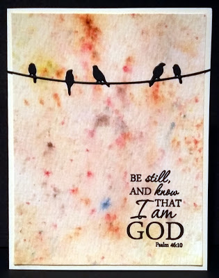
Bird Confetti


I have used "watercolor" paper before that was labeled as such, but then when you start applying water, the paper curls up, or the brush messes up the tooth of the paper. That's why I LOVE Tim Holtz's watercolor paper, because it holds up to all kinds of watercolor abuse! You can get the paper really soaked, but it will dry up nicely. And the paper is 2-sided, with good texture on one side, and smoother on the other. In my card above, you can see that I used the textured side.

The confetti-cake look of the background was achieved by squirting Ken Oliver's Color Burst powders onto the paper, and then misting them with water. I used a combination of yellow ochre, burnt orange, and sepia; however, each of these colors contains granules of other colors (for example green, mixed in with the yellow), which accounts for the spots of blues, purples and reds that you see.

I was so late to jump on the bandwagon of stamp platforms, that I ended up just kind of running along behind it. But when I finally got one -- the Tim Holtz/Tonic platform - I can see what all the fuss is about! Although I haven't had it long, I know it has saved some cards. In the case of this card, since I was stamping on texture, the first take, though pretty good, didn't come out as dark as I liked, so I just inked up the stamp and hit it again. Nice, rich color was my result.

I like the pairing of this verse with the birds, because they are showing us how it's done: to be still, and know that God is there -- the perfect example of trust!

Thanks for looking! Have a great Wednesday. :)

Supplies:
Stamps - Verve scripture stamp
Paper - Tim Holtz watercolor paper
Ink - Versafine onyx black
Dies - unbranded birds on a wire die
Accessories - Ken Oliver Color Burst powders

Friday, August 3, 2018

Tropical Dream


This printed paper featured a big red flower right in the middle of the sheet.


It was a little "much" to deal with, so I cut a narrow strip off the side of the page to avoid the red, and this gave me softer colors.

If I had to name this card layout, I'd call it "The Hug," because it looks like the printed strips are reaching around the paper in a big hug. And then I would remind myself of what I tell my kids: sometimes it's okay to think things without saying them out loud. LOL

Enjoy your weekend!

Supplies:
Stamps - "New Dream" by Verve
Paper - Love Nicole "Bouquet of Color" pad
Ink - Memento "Teal Zeal"

Monday, July 30, 2018

Purple Sympathy


I tried a different watercolor medium this week -- Ken Oliver's Color Burst powders. I've used the powders before to make beautiful abstract backgrounds, but this is the first time I used them with a brush to color "inside the lines." The colors are super vivid, and I found myself adding water and blotting to try to tone down the color a bit. It's amazing how far a few tiny flakes of powder could go! When I finished coloring the flowers ("Flower Fields" by Stampendous), I used the paintbrush "tap" technique to add sprinkles of color to the background. To do this, I got plenty of the color on the brush, held the brush firmly over the paper horizontally, and then tapped the handle of the brush with the index finger of my other hand, which allowed the color to be flung around a bit. I added the tag with the sentiment by Verve, and framed out my picture to complete it. This is an easy way to use some of those larger images, and is quick when you need a card to send out on short notice.

Thanks for stopping by! Have a great week!

Wednesday, July 25, 2018

Plaid with Flowers


This week's CAS challenge at Splitcoast asked us to use plaid in our creations. I actually had a piece of plaid out on my table with this teal textured cardstock that I thought could work together, and when I found this scalloped circle in a baggie of leftover elements, the card came together.

The flowers are from the "Enamor" clear set by Penny Black, and the sentiment is from "Kind Words" by Verve. I used copic markers to color the flowers. The plaid paper is from and American Crafts 6x6 pad called "#summer" -- which is filled with some of the brightest colors and designs I've ever seen in papers! Just using a small strip like this helps to tone it down a bit.

I have a special coupon code for Hambo Stamps that is good thru the rest of this month. Mention "CAS35" when you order to save 35% on all Hambo stamps thru next Tuesday (31st). This code is not referenced on the Hambo website anywhere, and is a special code just for my blog readers.

Have a great day!

Monday, July 23, 2018

Lacy Grace


Here once again is this beautiful "Grace" saying by Verve. I just love the typewriter font that the word "grace" is in! To make this clean and simple (CAS) card, I layered the floral designer paper (from Teresa Collins "Stationery Noted" 6 x 6 pad) over gray card stock, with a little strip of paper lace, made with a Crafter's Companion die. This is a design that would be so easy to mass produce, and you could use any print with coordinated card stock. Yep, I'll be doing this again...

Have a great week!

Friday, July 13, 2018

Branching Out


Here's a quickie I put together with three different dies. The leaf die originally had three leaves, so I trimmed one leaf off to give the little birdie a place to stand. I paper-pieced the bird like I did before, to give her some added interest. I say "her" because the brown and red reminds me of a female cardinal. I LOVE seeing these in my yard, and we usually have a pair of cardinals nesting in one of our trees each year. The label die is from a Becky Higgins set and is a great size for many of my scripture and sentiment stamps, though it also proved to work well for this bird and a saying. The sentiment is from the "Be Kind" set by Verve.

Can you see the texture on the leaves? There was a paper insert in a box of soap I'd bought, and rather than throw it away, I knew I'd find a use for it one day -- and that's how it became a branch with leaves. I like re-purposing things like this, but it's a slippery slope between saving things you'll use, and saving things and having them pile up, up, up! The trick is to actually USE it once you've saved it. :)

Have a happy and safe Friday the 13th!

Monday, July 9, 2018

Watercolor Sympathy


Today's card features an old stand-by stamp set, "Close as a Memory" by Stampin' Up. This set is so old, it's wood-mounted! I've become so spoiled by clear stamps, I'm not used to the guessing game of stamping and hoping I've lined it up straight. But besides that, this set is a great go-to for sympathy cards, because it's kind of fool-proof with the flowers and the great sentiments.

I started with Tim Holtz's "speckled" stencil and rubbed distress oxide ink to get the random spots in the background. I also used the oxide ink to sponge around the edges. Next, I inked up the flower stamp using Tim Holtz distress markers, and spritzed the inked stamp with water before stamping it. The sentiment was stamped onto the "Classy Label" die by Verve, and popped up with dimensionals.

Here is the inside sentiment:


I love the wording of both of these sayings!

About my cardstock: Like many, my first introduction to stamping was through Stampin' Up!, back in 2001. At the time, I bought a lot of packs of their cardstock families, and inherited more when my sister retired as a demonstrator years later. Since then, SU has gone through so many "in colors" and have retired and replaced colors, but I still have my original stash. This blue cardstock is from SU, but I don't know the color, and even if I did, chances are good that it's either retired now or called something different. So please forgive me in the future for not giving the name of the color of cardstock, because frankly, other than a few of my favorite classic colors (old olive, eggplant envy, chocolate chip), the names really didn't register with me.

Have a great week!

Monday, July 2, 2018

Making Some Noise

REMINDER: Now thru July 8, enjoy 40% off ALL Hambo stamps! See our SALE page for details. 

Now on to today's card:


While on a stamp retreat years ago with some of my Hambo Stamps designers, I was privileged to receive a tutorial from card-maker extraordinaire Melissa Edwards. She is a master of coloring, but the technique she showed us was using markers on an acrylic block and spritzing to do easy water-colored backgrounds. I've since made dozens of cards (you can see some here and here) using her technique, because not only is it very easy to do, but the results are STUNNING. But we didn't merely lay down the watercolor -- she taught us to add "noise" to the color, which kicks it up a notch.

My card above demonstrates such "noise." Although this time I used a swatch of designer paper instead of using markers to make the water-colored strip, I still started with basic variations on a color:


Above is the paper I chose from Love Nicole's "Aquarelle" pad. I cut it down so that I just had purplish strip on the left. I could have left the strip as it was, glued my die cut on top and finished the card, but it would have looked a little more dull than it does with the added "noise." I started with a script background stamp, and stamped it in an ink that coordinated with the paper's design, but wasn't too dark. You want the noise to be there, but not stand out too much on its own. Next, I chose another coordinating color to stamp some leaves randomly over the script. The paper already had some white spots included in the design, so I was satisfied to stop there. You can see a close-up of the noise below:


With the paper now jazzed up, I was ready to glue it to my white card base, and add the "Prim Poppy" die cut. Finally, I finished the card with a scripture stamp from Verve. The noise adds just enough extra drama to help the die cut stand out a little more, and leads to a more interesting card.

Do you like to add noise? If you've never tried it, give it a shot, and feel free to link up your result in the comments below.

Happy stamping!

Supplies:

Stamps - scripture from "Scripture Medley 4" by Verve; script background by Recollections; leaves from "Fanciful Filaments" set by Hero Arts
Paper - "Aquarelle" (6 x 6 pad) by Love Nicole

Ink - Memento "Lilac Posies" for sentiment and leaves; "Sweet Plum" for script background

Dies - "Prim Poppy" by Memory Box 

Monday, June 18, 2018

In Distress


I'm unable to read or hear the scripture on today's card, without automatically starting to sing the song in my head that we sang in rounds at summer camp. Does anyone else know the song? It is simply the words of Philippians 4:4 repeated over and over. Still, it's quite catchy, and an easy way to learn and remember the verse. This is one of the stamps in Verve's "Scripture Medley 1" set.

Craft cardstock serves as the base of this card, which I thought coordinated well with the distressed patterned paper from an old Making Memories "Travel" pad. I added a couple of cardboard buttons tied with cord.

While on the subject of distressed, I'll go ahead and share a bonus card I made in the same sitting:


This card makes me laugh, because in one photo I took of it, you would think you'd have to wash your hands after handling it -- it was very dingy looking. Thankfully the other photos came out better. This one also uses a patterned paper called "post mark" from the same "Travel" pad as the paper above, along with a craft cardstock base. The "thanks" is a stamp by Hero Arts.

I think the "thanks" card is appropriate, since you'll certainly want to thank me for the earbug, if you played the song on Youtube that I linked above. You're welcome! ;)

Friday, June 15, 2018

All My Hope


When I did a shout-out to Verve Stamps a couple of weeks ago, I pictured the freebies that had accompanied my order, including designer papers, a doily and a printed sentiment. The card above is what I was able to make with those things. I also used Stampin' Up grey cardstock for the card base, and old olive cardstock to frame the sentiment. I sponged "Worn Lipstick" Distress Oxide Ink over the doily.

I am entering my card in Jeannie's Dragonfly Journeys challenge, which is to include roses on your card. There are lots of them in the DP, so this is an easy qualifier. There's still more than a week left to play along if you have a rose project to share!

Thanks for looking, and have a great weekend!

Wednesday, June 13, 2018

Such a Joy!


When I heard that Verve was closing, I hurriedly placed one last order before everything was gone. I was excited to get a couple more scripture sets, as well as a nice general-purpose set called "Be Kind," from which this sentiment comes. Inside, I stamped "hugs and smiles" from the same set. I won't bother linking to the set now, since it has sold out and will no longer be available.

The "Classy Label" die is also from Verve. When I stamped the sentiment, which is lined up at an angle as you see above, there was room left on the label for something else. This "Be Kind" set also included a stamp with a couple of solid flowers, so I chose it for the corner. However, the flowers didn't match exactly, so I got a purple pen and added some outlines to match the design on the patterned paper (from Love Nicole's "Blooming" 6x6 pad). I'm not sure I LOVE the result, but it DID make the flowers coordinate a little better, so I kept it. What's your vote, yes or no?

Friday, June 8, 2018

Clothed with Strength


Here is another of those easy cards where you let the pretty paper do all the work. Here, I used a floral design from the Love Nicole "Aquarelle" 6x6 pad, and stamped the Verve sentiment. This verse is included in the "Scripture Medley 4" clear set. (In real life the ink color is not purple as it appears in the photo, but rather a deep pink that matches the flowers.)

My kids get out of school today, so I while I HOPE to be clothed in strength and dignity, I will DEFINITELY be clothed in a sundress and flip flops in the near future! Have a great weekend!

Wednesday, June 6, 2018

Dream a New Dream


I mentioned in a post last week about getting some great deals at Verve, and this "New Dream" stamp is the one I picked up for 75-cents. However, it is probably sold out now because Julee Tilman, the owner of Verve, just announced that she's closing up shop. I'm SO sorry to see Verve go, because they had such perfect stamps for card ministry. In fact, I snatched up a couple more scripture sets before they were gone forever. Even though some of the scriptures will be duplicates of stamps I already have, I use them so often, it will be reassuring to know that I have back-ups in case I wear the originals out!

The paper is from the Pebbles "Garden Party" 6x6 pad, and the card is finished off with a butterfly die cut.

Happy Wednesday!

Friday, May 25, 2018

Grace


I mentioned this "Grace" verse in my last post; it is part of a Verve scripture set, and I love it!

I pretty much only make easy cards, and this one is no exception. As mentioned before, I can't add lots of layers, because with my card ministry, I will have other people mailing the cards who might not know that a thick, fussy card could require extra care or postage. I keep it easy for me and easy for whoever will end up sending this card off.

Here, I used a floral paper from Love Nicole's "Delicate Floret" 6 x 6 pad. I have a lot of the Love Nicole papers, because I live within walking distance of an AC Moore, and they always have these pads on sale.

Card ministry tip: This card, like all of the others I make, is an A2 size (4¼" x 5½"). I use this size exclusively for the card ministry because lots of times people who send cards don't know what to write inside, and thus are scared off from sending a card. For a card this size, with a scripture or simple "thinking of you/missing you" greeting stamped inside, there is only a half page or so of white space left. All you'd need to add is a sentence or two with a signature, and the inside looks full. I found through experience that this size card is sent much more readily than a regular greeting card size, which would sit on the card rack for months. These small cards are grabbed quickly, so it was easy to see that this size is preferred.

Thanks for stopping by today! Enjoy your Memorial Day weekend.

Wednesday, May 23, 2018

Shout Out to Verve Stamps

When linking to the Verve stamp I used on my last card, I realized that Verve no longer sells these "Plain Jane" scripture stamps. I was really upset to learn this at first, until I saw that these same scripture stamps that have become favorites of mine to use are now available in sets. AND, there was a great set on sale full of verses I don't have, so I quickly ordered the set, along with another clearance sentiment that was marked down to 75 cents. Are you kidding me? 75 cents for a beautiful sentiment? Yes, please!

I shouldn't have been shocked when my order arrived less than 48 hours later, because I've bought from Verve before. But not only did my order arrive FAST and packaged beautifully in pretty tissue paper, but there were lots of extras thrown in:


In addition to the stamps I ordered, they included some coordinated papers, a paper doily, a stamped sentiment, plus a free clear stamp that says "Enjoy today" -- everything I need to make a card. Awesome!

In case you're interested, this scripture set is called Scripture Medley 4. It includes 8 scriptures and one beautiful "grace" sentiment that says "Grace... meets us where we are, but does not leave us where it found us."

Needless to say, I'm thrilled with my ordering experience, and wanted to spread the word. I'm not affiliated with Verve in any way -- heck, I run a competing stamp company! --  I'm just sharing this as a happy customer.

Monday, May 21, 2018

Stencil 2 Ways

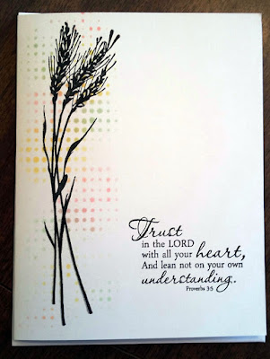
I have two cards for you today, both using the same "Dot Fade" stencil by Tim Holtz, but in a yin/yang kind of way. For the first card, I used different colors of Ranger oxide inks to color over the stencil, until I had a random pattern of colored dots. Over this, I stamped wheat stalks from Inkadinkado's "Meadow" set, and finally added the Proverbs 3:5 scripture stamp from "Scripture Medley 1" by Verve. This resulted in a very quick one layer card which will be perfect for my card ministry, in that it can be sent for any occasion.


As I began to clean up, I noticed that I still had quite of bit of oxide ink residue left on the stencil. Instead of wiping it off, I misted it up, turned the stencil over, and positioned it on a new white card base. Because the oxide ink reacts with water, I ended up with a beautiful water-colored design.


This time I used a Memory Box "Prim Poppy" die cut over the colors, and stamped a sentiment from Penny Black's "Faith" clear set. And just like that, two super simple, minutes-to-make cards!