Showing posts with label CAS. Show all posts

Monday, August 27, 2018

Flower Box


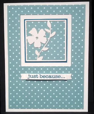
This card is straightforward, but here's a quick rundown of the layers. The flower box die cut is white, with a polka dot background behind it, mounted on a solid teal square. The same polka dot paper (sorry, I don't remember the source) is layered on top of a white note card, with a square cut out -- inside which the flower box layers were centered. The sentiment banner was folded so that it stands up from the card for a little added depth. It might sound more complicated than it was!

Enjoy your week!

Supplies:
Stamps - sentiment from Hero Arts "Everyday Sayings"
Ink - Memento "Teal Zeal"
Dies - Pinkfresh Studio "Floral Squares"; Spellbinders square

Friday, August 24, 2018

Steadfast Spirit


I don't have much to say about this card, other than the fact that I liked cutting in the curved shape to make room for the sentiment. The blues in this one didn't photograph well, so they don't appear to match too well, when in fact the blue of the flower and lace perfectly coordinates with the blues in the paper, in real life.

Sometimes I get a little too literal with these card ministry cards, and worry that I might be offending the recipient. Take this card, for instance: am I (me the card maker) asking God for a pure heart, or is it the implication that the recipient needs a pure heart? (I mean, we ALL do, but I think that's a conclusion for each of us to reach for ourselves, rather than me suggest that someone else clean up their act.) Sometimes it's best that I just get out of my own head and not worry about it. Does this happen to anyone else?

Mentally unbalanced or not, I'm glad you stopped by today! Have a great weekend!


Supplies:
Stamps - Verve Scripture Medley 1
Paper - Pebbles "Garden Party"
Ink -  Memento "Love Letter"
Dies - unbranded edge border dies; unbranded lacy flower die

Wednesday, August 22, 2018

Bird Confetti


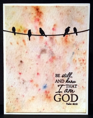
I have used "watercolor" paper before that was labeled as such, but then when you start applying water, the paper curls up, or the brush messes up the tooth of the paper. That's why I LOVE Tim Holtz's watercolor paper, because it holds up to all kinds of watercolor abuse! You can get the paper really soaked, but it will dry up nicely. And the paper is 2-sided, with good texture on one side, and smoother on the other. In my card above, you can see that I used the textured side.

The confetti-cake look of the background was achieved by squirting Ken Oliver's Color Burst powders onto the paper, and then misting them with water. I used a combination of yellow ochre, burnt orange, and sepia; however, each of these colors contains granules of other colors (for example green, mixed in with the yellow), which accounts for the spots of blues, purples and reds that you see.

I was so late to jump on the bandwagon of stamp platforms, that I ended up just kind of running along behind it. But when I finally got one -- the Tim Holtz/Tonic platform - I can see what all the fuss is about! Although I haven't had it long, I know it has saved some cards. In the case of this card, since I was stamping on texture, the first take, though pretty good, didn't come out as dark as I liked, so I just inked up the stamp and hit it again. Nice, rich color was my result.

I like the pairing of this verse with the birds, because they are showing us how it's done: to be still, and know that God is there -- the perfect example of trust!

Thanks for looking! Have a great Wednesday. :)

Supplies:
Stamps - Verve scripture stamp
Paper - Tim Holtz watercolor paper
Ink - Versafine onyx black
Dies - unbranded birds on a wire die
Accessories - Ken Oliver Color Burst powders
Monday, August 20, 2018

Split Personality

I have two cards to share today that use the same basic layout.


This first one features a two-part butterfly (or moth?) die, which I like because you can use the solid die alone, or the detailed one, or you can combine the two as I did here. {Time out: I just Googled it, and one physical difference between a butterfly and moth deals with the antennae. A moth has feathery or comb-like antennae, and a butterfly's antennae are thin with club-like tips. So there you have it. Although it's hard to see, on the print there are tiny club-like tips, so those are butterflies. But I don't see any clubs on the die cut, so that one must be a moth. Which means despite the similar shape of the wings, I've apparently mismatched my insects, and now I feel stupid. So let's move on quickly...}

And my second card:


The "Forget Me Nots" seed pack image on this card was a rectangle I cut out of the designer paper. One sheet in the pad had different colored, coordinating seed pack images including this one, plus one for daffodils, pansies, lilies, daisies and peonies. These images along with the coordinating colors and patterns of paper made for some easy-to-design cards. I wanted to make an "I Miss You" card, and thought the sentiment paired well with these flowers, because both connote distance to me.

I'm subbing in a 1st and 2nd grade classroom today, so maybe I can teach the students about butterflies and moths, and they'll grow up smarter than I did. 

Have a great week!

Supplies - Card 1
Stamps - Hampton Art "Hope & Faith"
Paper - "Garden Party" by Pebbles
Ink - Versafine onyx black
Dies - unbranded butterfly

Supplies - Card 2
Stamps - from Hero Arts "Everyday Sayings"
Paper - "Garden Party" by Pebbles
Ink - Versafine onyx black

Friday, August 17, 2018

Butterfly Doily


This designer paper is different in that it seems to change color depending on what colors it's around. When I saw it in the pad, it looked like a grayish hue. My husband saw it and thought it had some green in it. But I liked the look of it paired with this chocolate brown paper, which makes the print sort of a mocha color. I thought the little doily resembled the flowers, so that's how the card came together. The butterfly just happened to be something small enough to fit on the doily. I wish you could see the shimmer on the butterfly's wings though -- that's my favorite part of the card.

Have a great weekend!

Supplies:
Stamps - sentiment by Hero Arts "Everyday Sayings"; Butterfly from Penny Black "Enamor" clear set
Paper - from Love Nicole "Delicate Floret" 6x6 pad
Ink - Versamark for sentiment; Ranger Adirondack "Espresso"
Dies - unbranded doily
Accessories - White embossing powder

Wednesday, August 15, 2018

Dragonfly Prayers


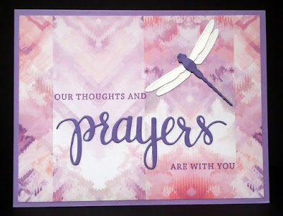
Here's another card where the pretty paper does all the work. All I had to do was add a nice sentiment, in this case, something from Hero Arts "Prayers" Stamp & Cut set. The word "prayers" is die cut, but the rest of the sentiment is stamped.

The hardest part of all of this was the dragonfly's wings; I usually use vellum when I make a dragonfly's wings, but the vellum just kind of disappeared on top of the paper design. White paper stood out as too bold. I finally settled on adding glitter spray to the white wings, which toned them down a bit and added a nice shimmer as well.

I've entered this card into Splitcoast's Clean & Simple challenge for the week - to make something with wings. There are some great entries there if you want to take a peek.

Enjoy your Wednesday!

Supplies:
Stamps - Hero Arts "Prayers" Stamp & Cut set
Paper - From Love Nicole "Aquarelle" pad
Ink - Memento "Sweet Plum"
Dies - Hero Arts "Prayers"; Memory Box "Dazzling Dragonfly"
Accessories - Tattered Angels "Iridescent Gold" Glimmer Mist

Monday, August 13, 2018

Cheater, Cheater


I don't know if this card should count for anything, because I did very little to make it. The main image comes from the front of a pack of very small note cards, one that is sent in the mail by an organization in hopes that you send a donation. I think there were 6 tiny cards in the pack, but the paper was very thin in addition to the small size. But the picture and verse on the front is beautiful, and perfect for card ministry, so I just "paid it forward" by jazzing up the cards a little and donating them to the card ministry of my church. I cut off the front panel and matted it with a coordinating color, and then attached it to a A2 size note card. I did all six of the cards this way, using different colors to mat, and I think each one was lovely. I wish I could give credit to the original artist, but even if it was included with the original packaging, these were received so many years ago, I no longer have that packaging.  I am glad, however, that I held on to the cards, and that they were finally able to be used.

Have a great week!

Friday, August 10, 2018

White on White


I've always thought cards with multiple white layers look very elegant -- especially when there is texture included, such as embossing. I've long admired others' cards, and finally took a stab at it myself.

I started by embossing the top layer, only I used a Darice embossing diffuser, in this case, a plate which has an oval cut out of the center. Used with the regular embossing folder, it keeps the area in the oval from being embossed, so it stays flat. After embossing the design, I then used an oval die over the flat oval to cut out the flat part, and also leave a nice border to the cut edge.

I stamped the sentiment on the bottom layer (the folded cardstock) and then adhered the embossed piece over it. Easy to do, and I like the results. If I wanted to make it more elegant -- such as for an invitation, a nice white satin ribbon would be pretty -- but I'm keeping this one flat so it's easier to mail.

Enjoy your weekend!

Supplies:
Stamps - Penny Black "All Great Things" clear set
Paper - plain white cardstock
Ink - Versafine onyx black
Dies - Spellbinder "Ovals"
Accessories - Darice embossing diffuser, Sizzix embossing folder

Friday, August 3, 2018

Tropical Dream


This printed paper featured a big red flower right in the middle of the sheet.


It was a little "much" to deal with, so I cut a narrow strip off the side of the page to avoid the red, and this gave me softer colors.

If I had to name this card layout, I'd call it "The Hug," because it looks like the printed strips are reaching around the paper in a big hug. And then I would remind myself of what I tell my kids: sometimes it's okay to think things without saying them out loud. LOL

Enjoy your weekend!

Supplies:
Stamps - "New Dream" by Verve
Paper - Love Nicole "Bouquet of Color" pad
Ink - Memento "Teal Zeal"

Wednesday, August 1, 2018

Cactus Joy


This one was fun to make! I'd like to say it's a one-layer card, but I suppose it's not technically one-layer when you use a die cut? The potted cacti are all one die which I then colored with copic markers.  Rather than have the plants "float" at the bottom of the card, I used a solid elliptical stamp to help anchor them. I had planned to mask the bottom of the pots so that the "rug" would stamp around them, but on my practice sheet, the masked version looked weird, so I just went ahead and let the rug show through. My daughter preferred the see-through version too, so maybe it's better not to overthink it.

Thanks for looking, and Happy August!!

Supplies:
Stamps - sentiment from Hampton Art clear "Hope & Faith" set; A Muse "Skinny Oval"
Ink - Memento "Northern Pine" for sentiment; Memento "Toffee Crunch" for oval
Dies - unbranded potted cacti

Monday, July 30, 2018

Purple Sympathy


I tried a different watercolor medium this week -- Ken Oliver's Color Burst powders. I've used the powders before to make beautiful abstract backgrounds, but this is the first time I used them with a brush to color "inside the lines." The colors are super vivid, and I found myself adding water and blotting to try to tone down the color a bit. It's amazing how far a few tiny flakes of powder could go! When I finished coloring the flowers ("Flower Fields" by Stampendous), I used the paintbrush "tap" technique to add sprinkles of color to the background. To do this, I got plenty of the color on the brush, held the brush firmly over the paper horizontally, and then tapped the handle of the brush with the index finger of my other hand, which allowed the color to be flung around a bit. I added the tag with the sentiment by Verve, and framed out my picture to complete it. This is an easy way to use some of those larger images, and is quick when you need a card to send out on short notice.

Thanks for stopping by! Have a great week!

Friday, July 27, 2018

Out on a Limb


It's been a while since I've used my Hambo Stamps, mostly because I've been concentrating on making card ministry cards, and I lean towards more elegant images and sentiments for those. But then I have to remind myself that different people enjoy different things, and maybe a pun will be just the thing to brighten someone's day!

Here, I've used the Hambo clear "Owl" set, and colored the owl and the branch with copic markers. I'm identifying with this owl, as I too am feeling extra "fluffy" around the middle. Summer is a time for ice cream and milkshakes, and, well, you know how that goes. But I digress... The beautiful leaf print is another design in the "Aquarelle" pad, by Love Nicole. I popped up the sentiment with dimensionals, thus satisfying the "Ways to Use It" challenge for this week at Splitcoast. I love using dimensionals, so there was really no challenge in it for me. Perhaps I should push myself a bit harder next time.

Hope your weekend is a HOOT!!

Wednesday, July 25, 2018

Plaid with Flowers


This week's CAS challenge at Splitcoast asked us to use plaid in our creations. I actually had a piece of plaid out on my table with this teal textured cardstock that I thought could work together, and when I found this scalloped circle in a baggie of leftover elements, the card came together.

The flowers are from the "Enamor" clear set by Penny Black, and the sentiment is from "Kind Words" by Verve. I used copic markers to color the flowers. The plaid paper is from and American Crafts 6x6 pad called "#summer" -- which is filled with some of the brightest colors and designs I've ever seen in papers! Just using a small strip like this helps to tone it down a bit.

I have a special coupon code for Hambo Stamps that is good thru the rest of this month. Mention "CAS35" when you order to save 35% on all Hambo stamps thru next Tuesday (31st). This code is not referenced on the Hambo website anywhere, and is a special code just for my blog readers.

Have a great day!

Monday, July 23, 2018

Lacy Grace


Here once again is this beautiful "Grace" saying by Verve. I just love the typewriter font that the word "grace" is in! To make this clean and simple (CAS) card, I layered the floral designer paper (from Teresa Collins "Stationery Noted" 6 x 6 pad) over gray card stock, with a little strip of paper lace, made with a Crafter's Companion die. This is a design that would be so easy to mass produce, and you could use any print with coordinated card stock. Yep, I'll be doing this again...

Have a great week!

Friday, July 20, 2018

Abstract Hello


I'm having fun playing with my new "Floral Squares" dies from Pinkfresh Studio. One thing I like is that you can use the negative (cut out) portion of the die as well as the regular framed flower die, so with each cut, you have two die cuts you can create with. Here, I've used the negative portion, so the flower has been punched out of the purple paper.

The designer paper is from the "Aquarelle" pad by Love Nicole. Yes, I know I've used these papers a lot -- just a testament to how much I like them! This print is kind of wild, so I used a strip of vellum underneath the "hello" die (Hero Arts) so that it stands out a bit more.

It's the weekend! Hope you all have a great one!

Wednesday, July 18, 2018

Faith Hope Love ... and Persistence


One day I was playing around with Distress Oxide inks, and while not everything I made turned out the way I wanted, almost all produced something that could be salvaged. Such was the case with the colored panel above. The distressed piece as a whole was kind of crazy, but trimmed down, I liked this smaller panel. I embossed the Stampendous agapanthus flowers in white so they would stand out from the multicolored background. The sentiment is from the Penny Black clear set called "Faith."

I have to be honest: I had originally used this flower panel on another card that I'd made for my card ministry. I have a card rack in the lobby at church where people may browse the cards, and take any cards that they'd like, with the purpose of sending to a church member or friend who could use a lift in spirits.


Mostly I put general "hello/thinking of you" themed cards, with a few "get well" or "sympathy" cards thrown in, and the cards are usually chosen fairly quickly. Occasionally, though, there are "duds" -- cards that no one wants. The original one with this panel was one of those duds. I'd liked the card I made, but for some reason, no one else did. I got tired of seeing it left on the rack week after week, so I eventually brought it home. Not wanting to throw the whole thing out, I pulled this colored panel off the card and saved it, until I decided to use it on the card above. I put it back in the card rack the next week, and it was chosen immediately. This card wasn't that different than the original, but for whatever reason, this one must have spoken to someone, whereas the other one just sat there being aloof. LOL

I guess the lesson to be learned is to never throw anything away ... uh, be persistent! :)

Monday, July 16, 2018

God of Hope


Cards don't get much easier to make than this one -- even with the added step of framing the designer paper with a solid color of cardstock. This is more of that gorgeous paper from the Love Nicole "Aquarelle" pad. The stamp is from a set called "Gifts From Above" by Penny Black.

Short & sweet -- just like any Monday workday should be. Have a great week!

Friday, July 13, 2018

Branching Out


Here's a quickie I put together with three different dies. The leaf die originally had three leaves, so I trimmed one leaf off to give the little birdie a place to stand. I paper-pieced the bird like I did before, to give her some added interest. I say "her" because the brown and red reminds me of a female cardinal. I LOVE seeing these in my yard, and we usually have a pair of cardinals nesting in one of our trees each year. The label die is from a Becky Higgins set and is a great size for many of my scripture and sentiment stamps, though it also proved to work well for this bird and a saying. The sentiment is from the "Be Kind" set by Verve.

Can you see the texture on the leaves? There was a paper insert in a box of soap I'd bought, and rather than throw it away, I knew I'd find a use for it one day -- and that's how it became a branch with leaves. I like re-purposing things like this, but it's a slippery slope between saving things you'll use, and saving things and having them pile up, up, up! The trick is to actually USE it once you've saved it. :)

Have a happy and safe Friday the 13th!

Wednesday, July 11, 2018

Sailboat Peace


I played along with the Splitcoast "Clean and Simple" challenge #489, which was to make a "tropical" CAS card. If I went on a tropical vacation, I'd hope it would be like this "Beachfront Boat" stamp scene by Stampendous. Whether on that boat or on that beach, it looks so quiet and peaceful, I could think of no better sentiment! And because I will be using this in my card ministry, I paired the idea of peace with the inside scripture "Be still and know that I am God. - Psalm 46:10"

I'm also submitting this to the Dragonfly Journeys "Summer Lovin'" challenge. I'm sure everyone has some kind of summer stamps or dies, so link it up so we can see what YOU made! :)

Supplies:

Stamps - "Beachfront Boat" by Stampendous; "Holiday Word Borders" set by Hero Arts
Paper - "Aquarelle" (6 x 6 pad) by Love Nicole

Ink - Versafine onyx black; Ranger Distress Oxide inks for watercoloring
 

Monday, July 9, 2018

Watercolor Sympathy


Today's card features an old stand-by stamp set, "Close as a Memory" by Stampin' Up. This set is so old, it's wood-mounted! I've become so spoiled by clear stamps, I'm not used to the guessing game of stamping and hoping I've lined it up straight. But besides that, this set is a great go-to for sympathy cards, because it's kind of fool-proof with the flowers and the great sentiments.

I started with Tim Holtz's "speckled" stencil and rubbed distress oxide ink to get the random spots in the background. I also used the oxide ink to sponge around the edges. Next, I inked up the flower stamp using Tim Holtz distress markers, and spritzed the inked stamp with water before stamping it. The sentiment was stamped onto the "Classy Label" die by Verve, and popped up with dimensionals.

Here is the inside sentiment:


I love the wording of both of these sayings!

About my cardstock: Like many, my first introduction to stamping was through Stampin' Up!, back in 2001. At the time, I bought a lot of packs of their cardstock families, and inherited more when my sister retired as a demonstrator years later. Since then, SU has gone through so many "in colors" and have retired and replaced colors, but I still have my original stash. This blue cardstock is from SU, but I don't know the color, and even if I did, chances are good that it's either retired now or called something different. So please forgive me in the future for not giving the name of the color of cardstock, because frankly, other than a few of my favorite classic colors (old olive, eggplant envy, chocolate chip), the names really didn't register with me.

Have a great week!